Monday, February 27, 2012

Introducing Infographics - Make It About Them

Source: ASIDE, 2012
Yes, infographics make excellent tools to use in the classroom to help students understand complex information in a graphically appealing way, and yes, it would be great to have them create their own to reflect what they are learning. So, where do you start if you want to introduce infographics, and how do you explain what they are to your students? Perhaps a tougher question is: what can you use to design them that would help explain how images and data come together to portray information visually? Simple, have students make a graphic about themselves using IONZ.

On the IONZ website, make sure the students click the British flag in the top right corner for the English version. From there, it’s easy. Each student fills in the name field (first name only is fine) and then clicks the forward arrow. The student selects items to create a customized visualization based on key categories, including gender, means of transportation, favorite food and animal, number of e-mail accounts, way of messaging, use of social networking, and hours spent online and sleeping.
Source: IONZ

All categories must have an answer to complete the infographic. In some cases, we did have students who did not use any social networking websites. In those cases, we asked them to choose one to continue. This website makes it amusing to pick selections by having each of the small icons move as the mouse rolls over them. It also provides the percentage of that choice immediately before moving onto the next item. Kids will definitely have fun with it.


Source: ASIDE, 2012
At the end of the selection process, when the personal infographic is finished, IONZ provides a few options for customization, such as the background color, page orientation, and highlight color for the individual’s choices. Students can import a picture as part of the personalization and add a small typed message to appear just below their name as well. Lastly, it can be saved as a JPEG to use later.

Use the results of the completed visualizations to make comparisons. Students can compare their individual results with other classmates or with users who participate on IONZ. In addition, a host of math lessons based on percentages, averages, and ratios could be derived from this data. The bottom line is, once students understand how to look at themselves as an infographic, they can look at others to decode what they see.

For further information on designing your own visualizations, please check the infographics and resources pages on this blog.

Friday, February 24, 2012

Teaching With Technology - NYSAIS 2012

We just attended the 2012 NYSAIS Teaching With Technology Conference in New York. The New York State Association of Independent Schools (NYSAIS) holds this event annually to promote the practices of teachers using technology in their classrooms. This year, over 300 dedicated educators were in attendance, and many gave up time during their vacations to do so. The workshops assembled for the day provided a wealth of ideas to empower our students with engaging ways to learn using technology. It comes as no surprise that many of us wish we had another day to learn even more.

Source: Staples
Workshops on iPads in the classroom were particularly useful, since schools have, or are looking to set up, 1:1 programs. It was good to hear from others about planning such a program and about some of the problems they incurred with the deployment that in hindsight could have been avoided. Other workshops we found particularly valuable focused on shifting the classroom to the cloud, the impact of video streaming on learning, and a host of web 2.0 applications.

Source: ASIDE Student Infographics
Special thanks to the collegial crowd who attended our session on Designing Information: Infographics as Literacy. The thoughtful exchange of ideas and questions made for an enriching discussion. The infographic examples used in the presentation, as well as hundreds more, are available on this blog. We’ve arranged them by subject for easy accessibility, and our resources page contains the many available links for creating original graphics with students. All skill tips and curriculum tools are posted as well.

A special thanks to everyone on the NYSAIS TWT Committee for making this a great conference. If you were not able to attend, check out the Twitter hashtag #twt2012 to find out more.


Tuesday, February 21, 2012

The State of Infographics in Education

The ubiquity of infographics in popular media has nearly reached a saturation point in terms of interest and novelty. Print and online outlets, such as GOOD, Visual.ly, Mashable, and The New York Times, have promulgated these graphics to readers eager for crisp designs and concise messaging. It is surprising, therefore, that infographics still remain scarce in K-12 classrooms. Education has yet to catch up to the public fascination with visual displays of information. Perhaps this is because infographics do not fit neatly into district-defined, test-focused curricula. Infographics by their nature are interdisciplinary, combining layers of text, statistics, and creativity.

Source: The Millions, and Alberto Antoniazzi
Students naturally find infographics engaging, because they:
  • Portray ideas in colorful, pop art sensibilities
  • Appeal to visual learning styles 
  • Entertain the eye while encouraging decoding 

Teachers can find value in using infographics, because they:
  • Contain data-rich concepts within single snapshots
  • Promote the crucial skills of graphicacy 
  • Advocate critical thinking and cross-curricular learning 

Source: MakeUseOf
Infographics reinforce pedagoptics, which is a method of teaching with optical tools. This type of visual pedagogy relies on edsign, the educational design of information. In other words, pedagoptics represents the cognitive meeting point between the mental skills of iconography and semiology. Pedagoptics applies ocular acuity and analytical skills to academic contexts.

These visual tools are now more important than ever. Steve Lohr, in the New York Times Sunday Review, recently claimed that the "Age of Big Data" will require more and more students skilled in information analysis. Tim Kastelle, of the Innovation Leadership Network, argues similarly that "There's No Such Thing As Information Overload." Instead, thinkers need to be able to find and filter facts in a detail-driven world.

Maybe that's why this write-up from FastCoDesign, one of our favorite sites, strikes such a chord in explaining "Why Infographic Thinking Is The Future, Not A Fad." In this clip, Francesco Franchi, the art director for IL-Intelligence In Lifestyle, gives insight on "Visual Storytelling and New Languages In Journalism." He says infographics offer a "narrative language," using "representation plus interpretation to develop an idea:"


Francesco Franchi: On Visual Storytelling and New Languages in Journalism from Gestalten on Vimeo.

In the online magazine The Millions, Reif Larson recently offered a thorough recap of the evolution of graphic thinking. His essay, “This Chart Is A Lonely Hunter: The Narrative Eros Of The Infographic,” presents an engaging summary of data displays and visual storytelling. Larson even points to a new popular reliance on pictures as the fuel of social media:

"We’ve given today’s visual storytellers considerable power: for better or worse, they are the new meaning-makers, the priests of shorthand synthesis. We’re dependent on these priests to scrutinize, bundle, and produce beautiful information for us so that we can have our little infogasm and then retweet the information to our friends."
Source: Infogr.am

There are numerous tools to aid these emboldened visual storytellers. Our "Resources" page has a list of chart- and graph-makers, as well as infographic generators. Two promising new sites include Infogr.am, for creating custom graphics, and Maps For That!, for browsing a gallery of mind-mapping diagrams.

Source: Maps for That!
Check out our page of "Infographics" to find images for all academic disciplines. Listed by subject, the infographics are effective for daily lessons or presentations. For further reading about visual thinking and data visualization, here are some high-quality, recent articles:

Saturday, February 18, 2012

Visualizing the Effects of Peace

Source: Vision of Humanity
If we ask the question, “Which has more of an impact on society, peace or conflict, greed or giving, or hope or fear?”, we would no doubt see philosophical discussions on both sides of the debate. No matter which side of the argument, continual disruptions have taken a toll on the overall felling of peacefulness around the world. So much so, that the Protester was chosen as Time magazine's person of the year 2011. With the current state of world affairs, including the violence surrounding protests to topple governments, riots over economic austerity measures, and demands by occupiers on Wall Street, the constant global turmoil brings the need for peace front and center as something we should talk about with our students.

Conflict costs in human relations and taxes the economy at all levels. Infographic videos like the ones in this post from the Vision of Humanity can be used with students to emphasize the causes of conflict and their financial impact on the global marketplace. Numbers talk, and the costs to people, communities, and governments is enormous. The mission of the Vision of Humanity is to raise "the world’s attention and awareness around the importance of peace to humanity’s survival in the 21st century."

The 2011 Global Peace Index by the Vision of Humanity provides an overview of the impact of violence and how it ultimately takes a toll on the overall well-being of society, impeding economic growth.


Last year, the Vision of Humanity also launched its inaugural study, called the United States Peace Index, created with the Institute for Economics and Peace. This was the first time a ranking was used to gauge each state based on its level of peace. It used five key indicators, including homicides, violent crimes, people in prisons, number of police officers, and access to small arms, to see how each state fared based on these criteria. The resulting data was reproduced in the U.S. Peace Index: Changes in Peacefulness 1991-2009 and the U.S. Peace Index - 2011 charts. Each of these downloadable maps would help students visualize the changes in peacefulness across the United States. Pair this with current events and the economic downturn by region to open discussions about unemployment in America as it relates to geographic location.

Source: United States Peace Index
Peacefulness has a direct impact on the economy on multiple levels. This is a powerful teaching point. If we want the world to be a better place, we need to help students see the full impact of how unrest, violence, and instability affect it. In our history curricula from the ancient world to modern day, we talk about the "golden age" of civilizations. It takes peace and prosperity to achieve cultural achievements. Without the stability of governments and the economics of good trade, few advances can be made in other areas. The United States Peace Index video brings home this point using visuals, typography, and music to present a picture of how peacefulness and economic growth go hand-in-hand.


What tips the scale toward peacefulness depends on education, health and economic opportunity. The more effective our delivery in conveying the message of peace with our students, the better chance of helping them understand the long term costs of conflict. The positive approach to talking about the issues in the video, as well as its clear message, make it a good instructional tool to use, especially with younger students.

Source: Vision of Humanity
The Vision of Humanity's newest report for 20ll measures Peace in the Media.  It looks at how conflicts drive media coverage and how media coverage shapes conflicts. The report compares data from the Global Peace Index from the Institute for Economics & Peace with the database of global media from Media Tenor. The report looked at multiple variables, including media coverage of peace and conflict, or the lack of it. Perhaps the most important finding was that events that help promote peace and stability were deficient in countries suffering the most from conflict. To the contrary, countries with the most strife received far more coverage than those that achieved greater peacefulness. So what lessons can we glean from this? For one, the opportunistic need for media to make headlines and improve ratings is a perfect segue way into integrating media literacy and whether there is a balance in news coverage.


Students need to look closely at media reports surrounding peace and conflict. We need to provide a venue for an open dialogue for discussing the impact of peacefulness using engaging visualizations. Both the Vision of Humanity and Institute for Economics and Peace offer a wealth of information for teachers to make students better informed about the global impact on society if we continue in a world too focused on conflict.

Source: Institute for Economics & Peace


Wednesday, February 15, 2012

Designing A Candidacy - Students Rate The Logos

We've been taking a look at the 2012 presidential candidate logos since this summer. We've been trying to imagine how a slogan and a design might relay a candidate's brand and influence voters. Recently, we asked the same thing of our middle school students. We showed them the banner of each significant candidate still in the race, and we asked the students to judge the logo's appeal for themselves.

Source: ASIDE

We began the exercise in the same manner we approach political cartoons and photographs, using the four steps of graphicacy to understand an image. Specifically we asked:
  1. What visual elements do you see? How is the image constructed?
  2. What adjectives would you use to describe the logo or banner?
  3. Based on his/her logo, the candidate seems __________.
  4. Based on his/her logo, would you be more or less likely to vote for the candidate? (rating on a scale from -3 to +3)
What did we learn? Well, first, by an overwhelming margin, most students rated most banners a "0." Most designs had no impact on their likeliness to support a candidate. While this conclusion made for lukewarm data results, it hinted at larger electoral takeaways. A logo is traditionally a space-filler, something to wave or personalize a podium. It requires a special concept to turn a graphic into a game-changer. Poor designs can do damage, however, which explains why most campaigns are playing it safe for 2012.

Source: ASIDE
Secondly, Barack Obama and Newt Gingrich scored the highest among our middle schoolers. Both received positive marks for clear, positive, and modern imaging. Many students were not familiar with Obama's rising sun logo from 2008, and they, therefore, viewed his recent incarnation on its own merits.

Thirdly, President Obama had the most variability, with the fewest neutral ratings and the most extremely positive or negative opinions. Mitt Romney and Gingrich also enjoyed a range of scores and descriptions.

Finally, we learned what we already knew: middle schoolers are not easily impressed. Most of the images elicited a few half-hearted "eh"s. The worst sin was to be "boring," applied most frequently to Romney's logo. In fact, 2012 dropouts Michele Bachmann and Herman Cain rated higher among our students in their unexpected and intriguing designs. The biggest fan favorite was former Louisiana governor and current GOP outcast Buddy Roemer. We'll highlight his quirky carnival banner in an upcoming post.

Check out our other posts about design and education in the 2012 election.

Sunday, February 12, 2012

Valentine's Day: For the Love or Money Infographics

Source: FatWallet
In keeping with our previous posts, we pulled together some infographics related to Valentine's Day. These graphics fit nicely with the current sequencing of special days that most of our schools celebrate throughout the year. The infographics in this post, like many of the others, provide an ample amount of information to use with students across the curricula. They make great eye candy for any lesson, and we found that our students spend more time thinking about the information to draw conclusions, make comparisons, and analyze the data.

Source: Degree Search
As you can imagine, most of the infographics for Valentine's Day are about the enormous amount of money spent by consumers. Valentine's Day Consumer Spending from FatWallet, with its bright colors and crisp design, delineates the numbers behind the day in an eye-catching way that is easy to use with younger learners. It breaks down the information by gender and age, while offering some unique fun facts to boot. Another good one is We Love Spending from Degree Search. This infographic not only offers projections for the coming year, but also provides a host of data as to who spends more on their sweethearts, where they spend, and what they buy. Its festive colors and clear design make it a perfect way to engage learners in a little math.


Source: Savings.com
These infographics allow teachers an easy way to incorporate the skills of media and financial literacy into lessons. They act as a hook to get students to look at more. By analyzing enough of them, students learn to deconstruct infographics and build their skills in deciphering content for meaningful information. It helps them to make connections between the impact of consumer spending and the bottom line of industry profit. Spending Money On Your Honey from Savings.com is another example to illustrate the financial underpinnings of a holiday.

Source: Ethical Ocean

Each of these infographics can help students construct ideas to articulate their understanding about the branding and selling of an idea. They can visually see how it translates into dollars. For a hard look at the chocolate consumption and how it relates to the producers of cocoa, have students look at the infographic A Fair Valentine from Ethical Ocean and ask them to discuss whether the growers are given a fair portion of the total sale price of chocolate. Let’s face it, at the “heart” of the day, the companies that make chocolate, jewelry, flowers, and more do it for the love of money by romancing the consumer.

Source: Visual.ly
A few others that are a nice addition to the mix are The Valentine's Day Around the World from Visual.ly, with its fun facts using language and geography, and At the Heart of Valentine's Day from Frugal Dad.  The multiple possibilities for lessons in sequencing, time, and percentages over a particular time period, whether historically or currently, also make for lively discussions within the classroom. Whether for love, or money, using infographics as a learning tool to engage students is at the heart of the matter.

Source: Frugal Dad

Tuesday, February 7, 2012

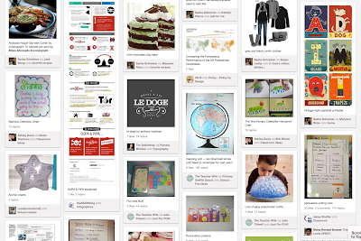
In The Pinterest Of Education

Source: Pinterest
In a matter of months, Pinterest has carved out a unique social space among the networks of status updates and limited characters. Now the fastest growing new medium, Pinterest began two years ago but only recently saw its visitors increase from 418,000 in May 2011 to 7.5 million by December. Pinterest combines the best of social sharing and individual creativity. Users collect visuals from around the web and create virtual pinboards to organize ideas or share clippings. Educators are uniquely poised to tap into this tidy, engrossing, graphic scrapbook.

Here is our collection of Pinterest boards, if you want to take a look: pinterest.com/theasideblog.

Many analysts have tried to “pin” down the reasons for this bloom, even dwelling on an irrelevant gender-typing of Pinterest as “shopping for women.” If the data shows that men are catching up in their usage, it only validates the fact that Pinterest now provides more traffic referrals than YouTube, Google+, Reddit, and LinkedIn combined. One Alaskan handywoman, for example, enjoys over three million monthly visitors to her blog and 6,000 daily views via Pinterest linkage.

Source: Pinterest

The number of educational pages, however, still lags the Pinterest mainstream. In theory, teachers should be prime candidates to benefit from Pinterest’s features and followers. The visual nature and the easy partnering of ideas make it an optimal site for students to expand their horizons. Here are five reasons to become a Pinteresting teacher:
Source: Pinterest

1. Pinterest is the epitome of personal curation. It offers easy-access bookmarking, like Diigo or StumbleUpon, but in an efficient, visual layout. Teachers can catalog images to use in class or gather ideas for bulletin board displays. They can preserve the best of their browsing or design a portfolio of their favorite pages. Pinterest quickly gathers graphics for lessons or ideas to revisit later.

2. Pinterest is ideal to use with students. It reinforces the visual learning modality, particularly in an age when most children gain data through optical inputs. Pinterest equals note-taking for a generation of visual pupils. Instead of copying research facts in a traditional fashion, learners can collate details into a digital journal. Pinterest also teaches essential, higher-level skills. It emphasizes symbolism and metaphor by ascribing definitional value to a set of collated images. It utilizes context as the clue to larger significance.

Source: Pinterest
3. Pinterest prods students to pay attention. It echoes the advice of marketing consultant Andy Stefanovich, who urges innovators to “Look at More Stuff; Think About It Harder (LAMSTAIH).” Pinterest culls attention-grabbing images to enliven a page or post. The optics can encapsulate a message that a stream of text can often obscure. Pinboards virtually spark the imagination like the inspiration walls that designers and decorators have been using for years.

4. Pinterest’s array allows for broad visual scanning. By arranging images in a scrolling digest, students’ eyes and minds can take in large fields of information. Edward Tufte claims that displays are too often simplified for linear PowerPoint presentations and gratuitous white space. Pinterest gives credit to the proficiency of the user, who can enjoy its range of clever and quirky images. Students’ brains absorb subtlety and appreciate the connections made through juxtaposed images. As a teaching tool initiated by the student herself, a pinboard offers more texture of sense than a single image can yield. It affords a coalescence of meaning through spatial adjacency.
Source: Pinterest

5. Finally, Pinterest is social networking at its best. Friends become recommenders. Followings offer suggestions, rather than self-indulgent updates. Most pinners grab what surprises them, so a student can witness a litany of unexpected visual delights based on self-identified categories. Also, as with Twitter, users have an incentive to populate their boards, to satisfy the curiosity of their followers and validate those fans’ faiths in their expertise. In this sense, Pinterest nudges out Instagram, which relies on charming snapshots but a one-way mode of delivery. In browsing boards and media, students and teachers may realize the dream of the strolling cyberflâneur.

Here is a good list from The Teacher's Lane of teachers currently featured on Pinterest.

Friday, February 3, 2012

Mapping by Hand: Another Case For Paper

Source: 5th Grade Student
As educators, most of us know where to find blank outline maps of the world, continents, and countries for our students to label. In addition, we can point students in the right direction to a myriad of Web resources to practice geography, such as Traveler IQ or Sporcle. But too often, we don’t make time in our curricula to have students draw maps by hand with good old-fashioned pencil and paper. Yet the benefits of such lessons are plentiful. It is not that one or the other makes a better geographer, but the inherent gain in understanding by creating a map on paper makes a difference in what students learn. In a world with GPS navigation systems in cars, or on mobile devices that literally tell us where to go, the ability to understand the relationship of relative and absolute location gets lost.

Source: 5th Grade Student
Labeling a blank map as opposed to actually drawing one by hand changes a student’s perception of place. The maps of South America in this post were all drawn by students in the fifth grade in two class periods. We are hoping to cover every continent as we work our way through the year. Hand-drawn maps require students to make connections physically between countries, states, or provinces. By building in time to let students draw, they used critical thinking skills on multiple levels. We’ve seen a direct correlation between the act of making it themselves and the knowledge acquired by doing so. As teachers, we want our students to create visualizations to increase understanding and be actively engaged in learning. It also helps them make associations between geographic locations and current events by putting the news in context with place.

Source: 5th Grade Student
For some, mapping by hand was not easy at first. They made mistakes that were sometimes frustrating, but by correcting the problem, they learned more. It trained their eye to draw what they see and not what they know. Adjusting a country’s size, leaving space for a significant landform, or using latitude and longitude for proximity helped them to be better designers of their own maps. These proud cartographers had to make choices. They learned to take feedback to improve the accuracy of their creations and to think about spatial adjacency.

Making maps by hand required studying the content and creating a visualization of what they saw. It was no longer a linear list of countries and capitals, or blank lines to label on a printout. It challenged them to think. We liken this to doodling, where the brain stays actively engaged to determine marks of content. When they were done, they not only admired their work, but they also knew the content. They owned it. It was a win-win, on all fronts, and worth the time. Next up is Africa, and they are ready and happy to take on the challenge.
Related Posts Plugin for WordPress, Blogger...


Pin It